
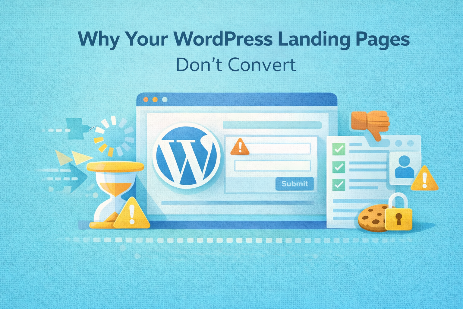
When a WordPress landing page fails to convert, teams often blame traffic quality, ad targeting, or copy. In reality, most conversion problems are caused by UX breakdowns that happen after the click.
The page loads. The content is there. But users hesitate, get confused, or lose trust — and leave.
At Wisegigs.eu, CRO audits repeatedly show that fixing UX issues on landing pages produces larger gains than changing ads or increasing traffic. This breakdown explains where WordPress landing pages typically fail and how UX mistakes quietly kill conversions.
1. The Page Doesn’t Answer “Am I in the Right Place?” Fast Enough
Users decide whether to stay within seconds.
Common UX failures:
Headline doesn’t match ad or link intent
Value proposition is vague or generic
Key benefit is buried below the fold
Too much explanation before clarity
If users can’t instantly confirm relevance, they bounce — even if the offer is strong.
Google emphasizes intent alignment as a core quality signal for landing pages:
https://developers.google.com/search/docs/fundamentals/creating-helpful-content
2. Visual Hierarchy Is Missing or Competing
Many WordPress landing pages try to do too much.
Symptoms:
Multiple CTAs with equal weight
No clear primary action
Dense content blocks
Important elements visually drowned out
UX should guide attention, not overwhelm it.
Smashing Magazine highlights visual hierarchy as a foundational usability principle:
https://www.smashingmagazine.com/
If users don’t know where to look or what to do next, they don’t convert.
3. The Page Feels Slow Even When It’s “Fast”
Performance is not just load time — it’s feedback.
UX-breaking behaviors:
Buttons with no immediate response
Forms that submit without indicators
Delayed transitions or animations
Layout shifts after load
Even fast pages can feel broken if interactions lack confirmation.
Google’s UX research shows perceived performance strongly impacts user behavior:
https://web.dev/rail/
4. Forms Create Friction Instead of Momentum
Forms are conversion choke points.
Common form UX mistakes:
Asking for too much information
No explanation of why data is needed
Errors shown only after submission
Clearing user input on errors
Each additional field adds cognitive and emotional cost.
At Wisegigs.eu, reducing form friction is often the fastest way to increase landing page conversions — without changing traffic or design.
5. Mobile UX Is Treated as an Afterthought
Most paid and organic landing page traffic is mobile.
Mobile-specific failures:
Touch targets too small
CTAs pushed below the fold
Popups covering content
Forms not optimized for mobile keyboards
Responsive design does not guarantee usable UX.
Google explicitly evaluates mobile usability as part of quality assessment:
https://developers.google.com/search/mobile-sites
If mobile users struggle, conversions collapse quietly.
6. Trust Signals Appear Too Late (or Not at All)
Landing pages ask users to commit — often before earning trust.
Missing trust elements:
No testimonials near CTAs
No security or privacy reassurance
No company credibility indicators
No clear contact or identity signals
Trust should reduce anxiety before users are asked to act.
At Wisegigs.eu, trust signals are placed at friction points — not buried at the bottom of the page.
7. CTAs Are Vague, Misleading, or Overused
“Submit” is not a conversion.
CTA problems:
Generic labels
Mismatch between CTA and result
Multiple competing CTAs
Low visual contrast
Clear CTAs set expectations and reduce hesitation.
Optimizely notes that CTA clarity consistently outperforms creative wording:
https://www.optimizely.com/optimization-glossary/call-to-action/
8. Too Many Distractions Kill Focus
Landing pages are not homepages.
Conversion-killing distractions:
Full navigation menus
Footer links
Blog links
Social icons
Multiple exit paths
Every extra option gives users permission to leave.
9. Analytics Don’t Reveal Where UX Breaks
Many teams can’t fix UX issues because they can’t see them.
Common tracking gaps:
No funnel tracking
No form interaction events
No scroll depth measurement
No distinction between micro and macro conversions
UX problems become invisible without proper data.
At Wisegigs.eu, CRO work always starts with validating analytics before design changes.
10. No Post-Conversion Continuity
The experience doesn’t end at the click.
Post-conversion failures:
Generic thank-you pages
No confirmation of next steps
No expectation setting
No follow-up guidance
A weak post-conversion experience reduces lead quality and trust.
UX Sanity Checklist for WordPress Landing Pages
Clear value proposition above the fold
One primary CTA
Fast, responsive interaction feedback
Minimal form friction
Mobile-first UX
Trust signals near conversion points
No unnecessary distractions
Measurable funnel events
If any of these fail, conversions leak.
Conclusion
Most WordPress landing pages don’t fail because of traffic or copy — they fail because UX introduces hesitation, friction, or doubt at critical moments. Fixing these issues often produces immediate conversion gains without increasing spend.
To recap:
Clarity beats creativity
UX must guide decisions
Performance includes feedback
Forms should respect user effort
Mobile UX is non-negotiable
Trust must appear early
UX decisions must be measurable
Need help diagnosing why your WordPress landing pages don’t convert? Contact Wisegigs.eu.