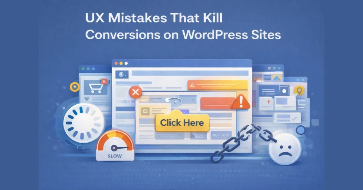
Conversion problems on WordPress sites are rarely caused by traffic quality alone. In most cases, users arrive with intent — but leave because the experience creates friction, confusion, or distrust. These issues often come from small UX mistakes that compound across pages, devices, and user journeys.
At Wisegigs.eu, CRO audits consistently show that fixing UX fundamentals often produces bigger gains than changing copy or increasing ad spend. This article breaks down the most common UX mistakes that quietly kill conversions on WordPress sites — and how to avoid them.
1. Slow Page Speed That Breaks User Momentum
Performance is a UX issue before it’s a technical one.
Common speed-related UX failures:
Long Time to First Byte (TTFB)
Heavy page builders loading unnecessary assets
Large, unoptimized images
Blocking scripts above the fold
Too many third-party tags
Why it kills conversions:
Users don’t “wait to see if it improves.” They leave.
Google’s Web Vitals research confirms that slow LCP and INP directly reduce conversion rates:
https://web.dev/vitals/
At Wisegigs.eu, performance optimization is always part of UX work — not a separate task.
2. Unclear Primary Call-to-Action (CTA)
If users don’t know what to do next, they won’t do anything.
Typical CTA mistakes:
Multiple competing primary CTAs
Vague labels (“Learn more”, “Click here”)
CTAs buried below long content blocks
Low-contrast buttons
CTAs that don’t match user intent
Better approach:
One primary action per page
Clear, outcome-focused CTA text
Strong visual contrast
Placement aligned with intent
3. Overloaded Layouts and Visual Noise
More elements rarely mean more conversions.
UX overload symptoms:
Too many fonts and colors
Multiple sliders and animations
Competing banners
Excessive icons and badges
Crowded above-the-fold sections
Impact:
Cognitive overload
Decision paralysis
Reduced comprehension
Lower trust
Good UX removes distractions instead of adding persuasion layers.
4. Poor Mobile Experience
Most WordPress traffic is mobile — but many sites are still desktop-first.
Common mobile UX mistakes:
Small tap targets
Forms that are hard to complete
Sticky elements covering content
Slow mobile performance
Desktop layouts crammed into mobile view
Google’s mobile UX guidelines highlight that usability issues on mobile drastically reduce engagement and conversions:
https://developers.google.com/search/mobile-sites
At Wisegigs.eu, mobile UX audits often uncover conversion losses invisible on desktop.
5. Forms That Ask for Too Much, Too Soon
Forms are the highest-friction point in most funnels.
Conversion-killing form issues:
Too many required fields
Asking for non-essential data
Poor field labeling
Unclear error messages
No explanation of why data is needed
Better UX pattern:
Ask only for what’s needed at that stage
Use progressive disclosure
Clearly explain value and privacy
Baymard Institute research consistently shows shorter, clearer forms outperform long ones:
https://baymard.com/research
6. Weak Trust Signals (or Too Many Fake Ones)
Trust is a prerequisite for conversion.
Trust mistakes:
No social proof
Outdated testimonials
Stock photos pretending to be real people
Overloaded “trust badges”
No clear company information
What actually works:
Real testimonials with context
Case studies
Clear contact information
Transparent policies
Consistent branding
Trust must feel earned, not forced.
7. Confusing Navigation and Information Architecture
If users can’t find what they’re looking for quickly, they leave.
Navigation issues:
Overloaded menus
Poor labeling
Hidden important pages
Too many levels of hierarchy
Inconsistent page structure
Smashing Magazine highlights that poor information architecture increases bounce rates even on high-quality content:
https://www.smashingmagazine.com/
8. Inconsistent UX Across Pages
Consistency builds confidence.
Common inconsistencies:
Different button styles across pages
Changing layouts without reason
Inconsistent tone or terminology
Different conversion paths per page
Result:
Reduced predictability
Lower trust
Higher cognitive load
A consistent system feels intentional and professional.
9. Ignoring Post-Click Experience
Many teams optimize ads but forget what happens after the click.
Post-click UX mistakes:
Landing pages not matching ad message
Slow-loading campaign pages
Missing next-step guidance
Generic thank-you pages
A conversion doesn’t end at the click — it ends when the user understands what happens next.
10. Measuring the Wrong UX Metrics
You can’t fix what you don’t measure correctly.
Common measurement mistakes:
Focusing only on conversion rate
Ignoring micro-conversions
Not tracking scroll depth or engagement
No session recordings or heatmaps
Better metrics:
Funnel drop-off points
Time to interaction
Form abandonment rate
Scroll behavior
Returning user behavior
At Wisegigs.eu, UX decisions are always backed by behavior data — not assumptions.
Conclusion
Most UX mistakes don’t look dramatic — but they quietly erode conversions day after day. Fixing speed issues, clarifying CTAs, simplifying layouts, improving mobile usability, and removing friction from forms often unlocks immediate gains without increasing traffic.
To recap, avoid these conversion killers:
Slow performance
Unclear CTAs
Visual overload
Poor mobile UX
Overcomplicated forms
Weak trust signals
Confusing navigation
Inconsistent design
Broken post-click journeys
Wrong metrics
Want a conversion-focused UX audit for your WordPress site? Contact Wisegigs.eu.
